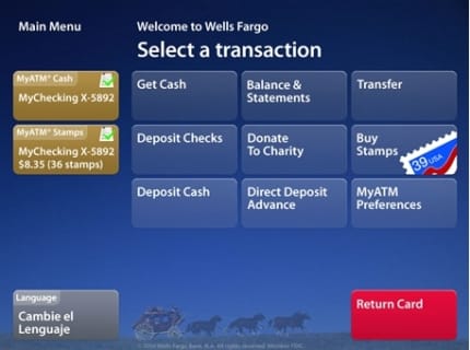
ATMs in Germany are lame, I have to say. They’re slow and clunky and appear to be designed by software engineers rather than UI designers.

So I wish interaction designer, Holger Struppek, Design Director of Hot Studio, was working here. He has written a explanatory piece for Physical Interface about the re-design of Wells Fargo’s ATM machines by Pentagram (where he was at the time of the design).
It’s quite a nice example of a classic interface design process for an interface that has a lot of pressures on it: multiple locations, different hardware, security issues, time pressures, accessibility, broad audience.
The jury in the comments seems to still be out about how successful it is – I find the grid of buttons a bit visually cramped – but it’s much better than the previous version. However, this part of the article about the colour-scheme favourites during user testing caught my eye:
Blue seemed to be a color that was genuinely pleasant to look at, and even though it was “off-brand”, everyone could live with it. It provided great contrast to the red Return Card button and the yellow alert boxes. During user testing, we presented participants with our color choices and got the same results: “It’s calming”, “I like the blue sky”, … and so we went with it.
Surprisingly, Wells Fargo recently switched the UI to the current tan color scheme. I don’t know what prompted that decision, but it does bring it back in line with their brand.
Surprisingly? Not really. Some brand managers will always want their brand colours to be in your face however ugly they are. Note to brand managers/marketers: If your brand colours are important enough to throw user testing out the window and infiltrate the UI, remember to choose some decent colours for your brand in the first place.
Maybe ATMs should look like this:

 Andy Polaine