Daniel Brown – Flower Power
(In an earlier unpublished draft of this I so wanted to title it “Dan Brown - The Da Vinci Coder”, but good taste prevailed. Now I get the chance to share the awful pun with the world. I still prefer it to ‘Flower Power’ though. - AP)
Some of the most successful people seem to thrive between the cracks of definition. The lack of a clear pigeonhole allows for interesting combinations of skills that pique the interest of those in overlapping disciplines. Daniel Brown, winner of the London Design Museum’s coveted Designer of the Year Award in 2004 is one such chameleon. He won the award for his web design when, by his own admission, he’s not really a web designer and would be considered more of an artist by many.
There is a mix of genetics and good fortune at play in Brown’s past. His father, Paul Brown, produced Europe’s first piece of computer animation for television way back in 1981. Like many of us that have ended up experimenting with interactive media, he had a home computer (a Commodore Vic 20 with 3k of memory) when he was very young. Early Hypermedia pioneer and family friend, Roy Stringer, invited Brown to experiment on his office’s Apple Macintosh in 1991 (it was worth $10,000 back then).
Brown joined Stringer’s company in 1996 and started working on research there. Long before the likes of Joshua Davis’s Praystation, Brown was publishing his experimental work on his micro-site, Noodlebox. Some of the works were simple experiments in generative graphics, others explored ideas of interaction. Using Macromedia Director and its Shockwave plug-in, Brown brought life to the web and Noodlebox’s popularity unexpectedly soared.
“I thought at the time it would be well received in the web design community,” says Brown. “But what I never expected was how well it would be recognised in the design/media/advertising community generally, and even in the public. Nor how long it would live. It probably had the height of its popularity about 2000/2001, almost five years after it was made, and still accounts for a large amount of requests to my site.”
Brown is now working with renowned fashion photographer and image-maker, Nick Knight at his experimental cross-media workshop SHOWstudio in London. The fashion world and the projects have helped him come to terms with the thorny question of whether he is a designer, artist, engineer or all three.
“It is the old ’engineering, design, crafts, applied arts, arts’ question I think. I would have had a much harder time answering this question ten years ago than I do now. And that’s partly due to having worked alongside the fashion industry for the last few years. The so-called ’traditional’ view of a designer is probably more akin to an ’engineer’ and that designing is completing a brief to the best quality at the cheapest cost. But we’re living in a Post-Modern society, where the mere fact that something was designed by a particular designer makes it more valuable. Branding and fashion have permeated the process itself. It’s easiest to see this in the fashion industry. Sure, some designers choose cost or technical innovation as their focus, others glamour and beauty. But one thing holds them together as designers - money, or more specifically, demand. And that’s why a fashion designer is not an artist.”
Winning Designer of the Year was very special for Brown. Not only was he following in the footsteps of Apple’s legendary vice-president of industrial design, Jonathan Ive, but it also came shortly after a swimming accident that left him paralysed from the shoulders down. It is gratifying to see the award go to designers who are willing to experiment and it also recognises the influence they have had over others. “I was flattered that web-design won full stop – I thought it was a great thing for the industry,” was his typically modest response.

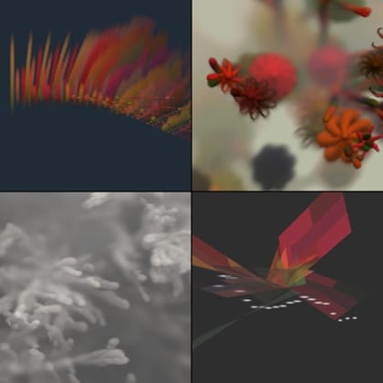
Although much of his upcoming work is under wraps, a recent favourite was his collaboration with Nick Knight on Dazed and Confused’s 10th birthday issue. “[Nick] had a huge amount to do in a short space of time - and he remembered a prototype tool I had shown him,” he explains. “Basically it was like a scratch-card, each time you ‘drew’ with the mouse you were revealing another random image. So he photographed all the models wearing clothes from the last ten years, all in the same ‘pose’. We then fed them into the software, and Nick produced these realtime photomontages. The end result was fantastic, and to boot we put the tool on SHOWstudio - so people could use the actual software/images.” The other project that has been absorbing Brown’s spare time is his generative flowers series on his Play/Create site. They are based on the “mathematics of nature” and are constantly evolving works, stemming from the early days of Noodlebox. “I’m up to about the eighth piece in the series, and yet I can still sit and stare at one of them for hours. They simply never get boring. And they’re selling well as private commissions to art buyers, which makes me happy.”
Anyone that has tried to exhibit a piece of interactivity will know the pain of watching people not “get it” and wander off disappointed. It is something that Brown is keenly aware of and it is guiding his future work. “The piece has to become apparent in less than about ten seconds,” he says of gallery works. “This is what interests me now. The idea behind Play/Create is very much ‘interactive music videos’ and as such the pieces have to be simple, and they have to be engaging. They’ve got to be as instinctive as listening to music, simply moving the mouse has to produce an elegant reaction if that’s all the user wants to do.”

This simplicity of engagement is something that often gets overlooked in the technology lead world of new media and it is often undervalued by the art world because it is so afraid of seeming trivial. But when you watch people in a gallery, they quite often spend less than ten seconds in front of a Picasso.
The mobile sphere is the obvious venue for future experiments. “[The] problem is that a lot of fashion people don’t do ‘computers’ so we’re looking at what kind of platform on mobile we could come up with that is more ‘visual’ more ‘fluid’ more ‘check this out’ when people are in a bar say. You know, what will people be using their games consoles for when everyone - including granny - has one? What will be interactive entertainment as opposed to games? This is what I’m thinking about.” In the meantime he will carry on playing and creating.
This article first appeared in the June 2005 issue of Desktop magazine.
 Andy Polaine