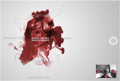
The website of Publicis & Hal Riney uses camera-tracking in Flash for the navigation - the first website to use it as far as I know.
Although described by a Twitterer as “Minority Report-like controls” (can we stop using that as the yardstick please!), it’s really more like the method used in the EyeToy Play.
I want to tell you it’s great and I’ll never want to navigate an old-skool website with a mouse again, but it isn’t and I don’t. The disconnect between my image (there in the bottom right) and the things I’m controlling (the arrows in the main part of the screen - you can see one on the right) destroys the most important part of any camera-tracking/multi-touch navigation: Because I’m having to mentally re-map the spacial relationships, the body as the affordance and direct manipulation of camera-based interaction is lost.
Besides, the mouse-based menu is a lot nicer to use and better designed.
They deserve kudos for giving it a go - and probably being the first - and the site itself uses the old ink-in-a-tank technique to great effect. It’s a nice job in Flash, but sadly the camera part is a novelty rather than ground-breaking - I soon went back to the mouse version.
The video loops of the head honchos talking on their mobiles is very cheesy agency style though. I’m pretty sure we’re beyond the time when talking on a mobile signifies you are important. Either that or my 13-year old nephew is running a multi-million dollar business.
 Andy Polaine