Continuing the From The Archives series, here is an interview I did a while ago with one of the IKEA designers, Monika Mulder. Monika was really interesting to chat to about the IKEA process and culture, especially as many of these items are in either my or friends’ houses. She also talked about design in terms of constraints of both price and packaging guiding design (IKEA try very hard not to “transport air”, for example), which are even more pertinent these days.
Dialogue with IKEA’s Monika Mulder
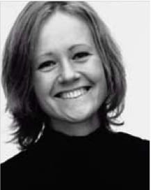
Monika Mulder
From humble beginnings in Sweden, IKEA has grown to become part of the fabric of global culture. Pioneering flat-packed self-assembly furniture and bold design, they brought style to the people at prices they could afford. As a designer for IKEA, Dutch-born Monika Mulder works on everything from children’s toys to furniture. She is graudate from the Eindhoven Design Academy and after an internship in 1996 was asked to join IKEA in 1998. Here, she speaks about the philosophy behind IKEA, designing within constraints and the cost of transporting air.
(Interview continues after the jump)…
AP: You have a job that I imagine many designers would be pretty envious of. IKEA has a strong philosophy behind it, how does that translate into your design process?
MM: Well, the most basic thing is that IKEA designs for many people. They want to have a wide range of products with good quality, function and shape for a price that many people can afford. That’s the most basic philosophy and how that influences my work is that most of the time we start by designing a price. So when I get a brief, I already know from the beginning which price level it will have to end on. In order to get low prices we designers travel to the factory to look at the production and design products that suit it, to use materials that are from that region or to see what the possibilities are. You often understand production better when you are there and you can come up with good ideas.
AP: Do you find it a pleasant challenge to work to quite tight constraints, whether that is price or this season’s range, or is that frustrating sometimes?
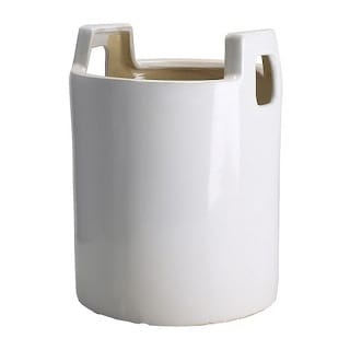
The Sandvita flowerpot
MM: When it comes to designing new articles it is good to have some borders and frames otherwise you can do anything and it’s too big to come to good ideas. These boundaries help me to focus and to be creative, because if you have to do a flower pot with the idea that we are not allowed to transport air – that is a sort of taboo at IKEA, because transporting air costs money – I have to come up with a concept where I can do something with the inside of the pot. So maybe I design something in three sizes that stack into each other, or maybe I design a little decorative item that will be used as a filler in transport. Or, for example, the Vallo watering can – I would never have thought of that shape if it were not for being forced to make it affordable in transport.
Vallo is an example of an item that I came up with out of my own initiative, because we weren’t asked for a watering can. The PS collection was being designed and prototypes were being made and there was so much furniture. The PS collection stands for Post Scriptum. It’s where we show what IKEA can stand for, where we show products with an edge, with more design value, with a twist or something extra. They work according to a theme, and this theme was “In and Out"like a green room.
I felt they needed something else other than furniture and, as we were talking about the garden, I was thinking about flowers and plants and I asked them why they didn’t have a watering can. So they said, “Well, do oneâ€. Then it struck me that when you have a watering can with a spout and a handle you can only fit three in a box and it is really inefficient with transport. So I had the idea to make them stackable and that was the starting point – I knew it had to be conical in shape.
What was important to me was that, yes you can make a can stackable and that is really good for IKEA because it can be made for a low price and it is good for the customer because they can buy it cheap, but then when the customer has the can at home, it’s not interesting for them that it is stackable. They shouldn’t look at the can and think, “Oh, it has that ugly shape because it has to be stackable.”
So, I went to the workshop with a big block of foam with the intention to make the shape nice, and I worked for a long time with it – I think I made five different models – until I was satisfied. The production has sort of steered the shape, in terms of how the handle is shaped to release from the mould. That’s why the pipe is a u-shape, but while I was working on it I thought, “This is great,” because it was necessary but at the same time I thought, “Yeah, this is good because you can see the water running out”.
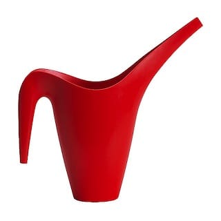
The famous Vallo watering can
_AP: So sometimes the briefs are quite specific, but do you have more abstract requests? _
MM: Yes, one example is a lamp that is still in the range called Skugga. They just said, “We want a lamp with the theme ‘happy’”. It’s like a little box coming from the wall and you can put slides in the front window.
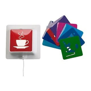
The Skugga lamp
AP: Which is a better way to work for you?
MM: Assignments differ a lot and if I only had the kind of assignments that were very specific then it wouldn’t be so fun. I even came with a sketch once that changed the whole business plan, because they wanted something with the theme “space” and I came with a little drinking mug for babies that looked like a penguin [called Mumsa]. They liked it so much that they changed the whole feeding range to from space to water animals.
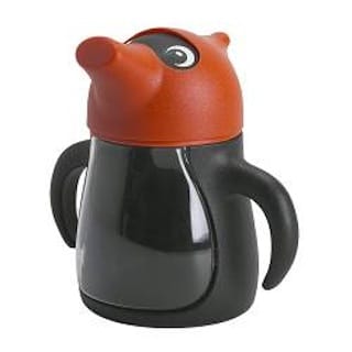
Mumsa
AP: One of the things about IKEA, and perhaps that comes from necessity, is that a lot of the style comes from bold shapes or uses of colour that people might not normally do…
MM: Yes, that’s true. They have this basic range but they are really daring with trying new things, because instead of competing by having the same article, they would rather have their own identity. Sometimes I have been really surprised that they took some sketch and went on with it. For example, I made a double bed that has armrests like in the back seat of a car; in the middle you have this thing that you can fold down. It is a cool idea that I sketched on the back of a presentation paper, but somebody discovered it and said, “That’s what we want!” I find it really fun that they dare to stick out. It’s not selling as much as the rest, but it draws attention and that’s what makes the customers come back because they find IKEA surprising and with a lot of choice – that they buy the basic bed after all, that’s another thing. The customer wants to have the choice but in the end they will buy safe.
_AP: Many companies spend a great deal of time and money designing packaging for their products in order to entice people to buy them. Clearly IKEA doesn’t do that, because the packaging is quite basic or things are unwrapped, but it is still incredibly successful. Do you think that is because the idea of having the store on display means that the store is effectively the packaging? _
MM: Yes, that is exactly it. Because the store shows the product so that you can see the possibility of what it can be. The customer decides there whether he wants the product, not when he is standing in front of the shelf in the warehouse. It is not the packaging in the end that is making the difference whether they buy the product or not.
The reason why [IKEA] has such a strong [business and style] plan is to coordinate, the carpets have to go together with the sofas style-wise and the glasses have to fit together with the kitchen. For the customers we have to be very clear, because an object makes a much better impact if it goes together in a whole, otherwise it just disappears. If you have one item in just a single style it becomes a mess. If you look into the store it is very co-ordinated.
AP: Have you ever designed something and been really surprised that it has been successful or the other way around, when you though it was going to be great and it hasn’t sold?
MM: Yes it happened many times. A good example of something that sold a lot surprisingly is a textile that I did for bedcovers called Brunkrisla. It was just a seasonal textile but it has been in the range for three years now and they don’t dare to take it away because it is such a big seller.
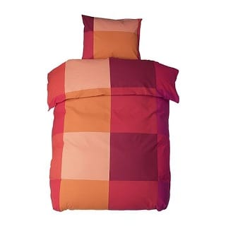
Brunkrisla
The child’s egg seat [Lomsk] too. It is pretty expensive because it is such a big plastic product with a lot of safety in it and a weight in the bottom and there is the hood too. So, it is like 69 Euros and honestly I didn’t think it would sell that much because I didn’t think parents would buy such expensive things for their children but it sells like crazy.
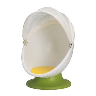
Lomsk
I think that the good thing about that one is that the children are sort of convincing their parents because, when they enter the store and they see that thing, they just run to it and want to sit in it. They understand it right away and they swivel and they close and open the hood. So the parents are so happy for the child and they want it. The child is doing the selling by playing.
AP: What kind of things inspire you, what influences your design?
MM: I look, of course, at everything around me. I also work a lot with people’s needs. If have to do storage, I really think of what people want to store and how their houses look. I try to think clever and about what is good for a customer to have. When it comes to style, it is a mix of my own tastes and what I feel I am longing for. You know after this period when everything was really straight and white, already in 1999 I started to long for patterns and colours and now you see it everywhere. So there are these natural trends and cycles that I think every designer has built-in.
UPDATE: The Story of Savo
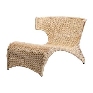
Savo
There is a story that Monika told me that never made it into the printed interview because we didn’t have space, but it is a great example of embracing the happy accident in design.
I had asked her about any disasters and she mentioned a wicker garden chair, Savo, that she had designed. When she got to the factory in China to look at the prototype it was clear that it was way too big. What had looked good on paper was enormous in real-life. She asked them to send it to IKEA in Sweden in any case, rather nervous about what everyone would say.
When the package turned up it seemed strangely small. In order to save on shipping costs the factory had sent a half-size version. As it happened, everyone loved it and it went into production at that size.
This article originally appeared Desktop Issue 198, October 2004. (C)2004 Niche Media Pty. Ltd. & Andy Polaine.
 Andy Polaine