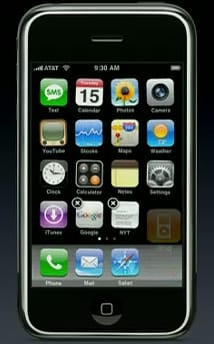
There are plenty of big announcements and coverage of Steve Jobs’s Macworld keynote. I’m happy to see the new AppleTV, movie downloads and rentals, and of course the MacBook Air.

But it was the the jiggling icons in the new iPhone home screen selection. When you are moving icons around and sorting them the icons jiggle in anticipation (or perhaps fear of being trashed).
Why does this frivolity matter? Well, the first thing for me is, of course, the playfulness of the interface. Die hard functionalists will probably hate it and find it an unnecessary waste of computing resources, but then so is any GUI.
Playful interfaces not only bring some pleasure to everyday tasks, they also encourage the user to explore and through exploring they learn the way the interface works. That’s what playing is all about and the good thing is it doesn’t feel like you are learning, it just feels intuitive or fun.
It also helps add personality to the interface and phones are extremely personal devices.
Lastly, why not? Everyone appreciates a pleasant physical environment - nice cutlery, a stylish lamp, a lovely pen, a favourite armchair. Most of those are necessary - a packing crate, an old door and a couple of piles of bricks functionally work as a desk set-up, but you wouldn’t want to work like that every day. We all spend an inordinate amount of hours on the computer or phone, it makes sense that it’s pleasant to use.
 Andy Polaine