I have been promising that I would like to upload all of the articles I have written over the years so that they might be of use for people rather than them languishing on my hard drive, but I’ve been a bit slack at actually doing so because converting them to decent HTML and fixing it all up takes a bit of time.
But Regine’s post on Visualizing: tracing an aesthetics of data inspired me to find the article on Jonathan Harris that I wrote a while back in 2004.
So, the plan from here on in is to upload one article from the archives per week (which would mean about two year’s worth of posts!).
Man of the Hour - Jonathan Harris
If recent world events have taught us anything about the media it must surely be that it is relentless organism. We have seen live videophone feeds from the frontline in Iraq, the explosion of blogging and RSS (Really Simple Syndication) news feeds and recently mobile phone camera images on the front pages of newspapers. Use any RSS news reader and you will see stories being updated 24 hours a day, seven days a week. With all this information flying around the Web, how can we make sense of it all and what would an hourly snapshot look like? That is exactly the question Jonathan Harris set out to answer with his 10x10 project. In an ironic twist the site held the number one slot on Blogdex for several days as news of its representation of news spread around the Web.
Originally from Vermont in the United States, Harris had a traditional Beaux-Arts training before studying computer science at Princeton University. As is often the case with those that have studied both the arts and computing, Harris developed an eye for how their intersection might shed light on the chaos of life. At Princeton he developed a program called _Extra!Extra!_that gathered similar news stories from over 75 sources around the world, so that you could read multiple accounts of the same story and glean a more balanced perspective. “It was a lot like Google News, one year before Google News,†he says. “In some ways, 10x10 was a natural extension of Extra!Extra!, but more about images and less about media bias.”
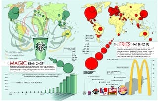
Throughout Harris’s earlier work, there is a strong emphasis on information design, from posters on world debt and health to re-interpreting cartography, many of which formed part of his work at the Princeton International Networks Archive.

“I’ve always found hidden patterns fascinating,†he explains. “As a little kid, I had this wonderful book called Trouble For Trumpets, by Peter Cross. It was filled with vastly intricate illustrations of this fictitious world, inhabited by a race of fuzzy orange creatures called Trumpets. Hiding in the pictures were a series of objects – faces gnarled into tree bark, banjos inside daffodils, mollusks in the moon. I would spend hours on end with this book, always convinced there were more hidden patterns to discover. Fast forward fifteen years to the present day, and I’m confronted with a whole new set of tools to escalate pattern finding to a global, real-time, hugely meaningful level.
“The Web has allowed us to look at humanity holistically, more or less, drawing conclusions about what matters in a given moment. A dataset like the Web is massively daunting, but if you can find meaningful niches to examine, it’s also massively inspiring. I’m intrigued by the idea of a collective unconscious, influencing us all in the same way, causing us to make the same choices as others, without knowing it.”

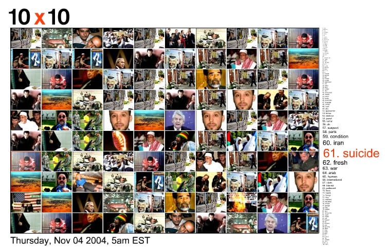
10x10 is, as most great ideas are, relatively simple in conception. It consists of a ten by ten grid of images, with an associated list of 100 words. The data is collected from several news sources (Reuters, the BBC and The New York Times) every hour. Harris’s code analyses the data and works out which are the most important words and pictures of the hour. Although Harris says that it “runs with no human intervention and makes no comment on news media bias”, the choice of (albeit well-respected) news sources does pass comment on the focus of the Western media because it quite clearly shows what news is decreed as important by those institutions. Harris plans to do a similar version including non-Western media or blog feeds in the future.
“It’s an ambitious idea and a controversial statement to claim to encapsulate an hour on planet earth,” he admits.“I expected to field a lot of heavy criticism. I was shocked and amazed by the overwhelmingly positive response. Within two days of its launch, over 90,000 unique visitors had seen 10x10, it was one of the top ten links on the entire web for several days, and I started receiving hundreds of emails a day from people all over the world, some of which were surprisingly emotional, as people were truly moved by what they saw in the grid.”
Harris describes November 11th, the day Yasser Arafat died, as crystallizing 10x10’s true nature for him when almost the entire grid was filled with pictures of the Palestinian leader.He feels it is a little like being a reclusive photographer on a rooftop, snapping away at the hustle and bustle below, detached from the emotion of it all. “When there’s a 9/11, or an Arafat death, 10x10 is there to record our reaction,” he says.
For something that has had such a wide resonance with the online community, Harris is not terribly inspired by the Web. “[Inspiration] usually comes from observing normal people in the world, and then thinking about how their experiences could be quantified and revealed, sometimes using the Web as a data source. My next project will be about Internet porn. It’s the most popular part of the Web, and one of the least often analysed.”

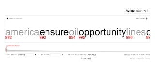
Another project, WordCount is an interactive visualization of the 88,000 most frequently used English words ranked and scaled in one long sentence (Andy is 3,352nd beating Desktop at 5,459th). Of course “the” is at the number one slot, but perhaps more revealing is QueryCount, which maps the most commonly searched for words within WordCount.
“I noticed that when people used WordCount, they rarely searched for common words like ’the’,” explains Harris. “By being so common, such words render themselves uninteresting. People tended to search instead, first for their name, and then for sexual words. I was curious to see whether this tendency was only shared by my ribald friends, or whether it applied to all users of WordCount. To answer this question, I created QueryCount, [which] has now logged hundreds of thousands of WordCount queries, and the top 30 or so words read like the public television censorship list.” No prizes for guessing which word beginning with ‘F’ is at the number one spot (oddly enough “celebration” is the least searched for word).
We can expect to see more of Harris’s work as he is currently on a residency at Fabrica in Italy, Benetton’s Research and Development Communication Centre (Update: Of course he’s no longer there - AP). Several other projects can be found at Number 27 as well as at his production company’s site, Flaming Toast (Update: Flaming Toast was subsumed by Number 27 since this article was written - AP). As if that wasn’t enough, he is also co-founder of a designer breath mint company called Oral Fixation Mints, which incidentally, has a beautiful website, just in case all that bad news leaves a nasty taste in your mouth.
This article was originally published in Desktop Magazine, January Issue, 2005. There are also several other posts on Playpen about Jonathan’s Harris more recent works that you might be interested in.
©2004 Andy Polaine & Niche Media Pty. Ltd.
 Andy Polaine