Or - In Praise of Randomness
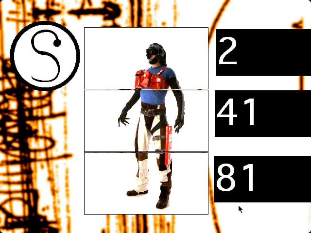
Whilst thinking about writing a post in praise of randomness in interaction design, I realised that StumbleUpon is, in many ways, the Antirom CD-ROM of the Web. In many, many ways StumbleUpon is much better, but here is the parallel with the original Antirom CD-ROM:
(Read On for more… this is going be a longer post than usual)
Randomness is Engaging
When we made Antirom CD-ROMs all had ‘home screens’ where all the navigation was. From there you branched off into other content and came back to the home screen. Sometimes a navigation bar was along the bottom, but in general that kind of fork and loop back method was the way ‘multimedia’ was conceptualised.
We found that very boring.
We were a collective of designers, artists, musicians, writers who had each created several small interactives, or ’toys’. In total there are about 50 of them on the Antirom CD-ROM. We initially thought that having several home screens, each with a subset of toys on them, that you randomly went to would be interesting. Then we realised we could effectively make every screen a home screen by simply letting the interactor click and go onto something else, something completely random. So the navigation, as it was, consisted basically of ‘click to find something else when you’re bored of this one’ (your cursor turned into an arrow at the bottom of the screen to indicate this) or ‘quit when you’ve had enough’ (the cursor turned into a bomb icon at the top of the screen.
The result was that you never knew what was coming next (although it would never be the toy you had just exited, but could be the one prior to that). This meant that you never knew if you had seen absolutely everything on the CD-ROM and that turned out to be strangely compelling. Something about wanting to have completed the contents kept you at it. And most of the content was pretty decent too.
The Web Made Things Predictable
Somewhat ironically for a system that allowed for hyperlinks to break narrative structure, the Web actually made things pretty predictable. Randomness, or clicking on a link that took you to random content was frowned upon by usability experts because it made people lost and good usability is (usually) about helping people not get lost. Randomness of the Antirom CD-ROM kind was the sort of thing that made Jakob Nielsen turn in his grave. Or it would if he were dead instead of just dead boring.
The main reason for this in the early web days was that it was such an arduous, slow task to download anything that not knowing where you are going was a risk not worth taking much of the time. All those terrible, bandwidth hungry skip-intros made in Flash really didn’t help either.
Granted not everyone has broadband, but broadband has changed the way in which most people surf the Web and sites like StumbleUpon (and many other social networking/recommendation sites) work brilliantly because they show you random stuff, things you would never have found if you knew where you were going. They brought back that hyperlinking randomness that had been missing for a while, the while we spent searching for stuff we knew was out there but didn’t know where.
Why Should We Care?
It turns out, as we have seen with all that social networking, tagging and sharing going on we pretty much like randomness. It’s what saves us from our boring routines and day. We shouldn’t be surprised, it’s what gossip has always been about - “Have you heard about xyz?” - and it is an essential part of human communication.
Now at this point, if you’re still reading, you might be thinking “That’s all very well but I wouldn’t want my online banking to be random art stuff.” My questions are why not, and what would happen if it was? Maybe not your account balances - though that might make you a bit more careful with your money - but imagine a banking website that was more random. It would mean all of the content would have to be a lot more engaging than in currently is and it might just make you stumble across something you didn’t know about but found useful or interesting.
I think we’re only just seeing the beginning of a return to this kind of interactivity online - at the very least, it’s very good thought experiment when it comes to designing sites and services that we normally think of as exempt from anything playful.
 Andy Polaine