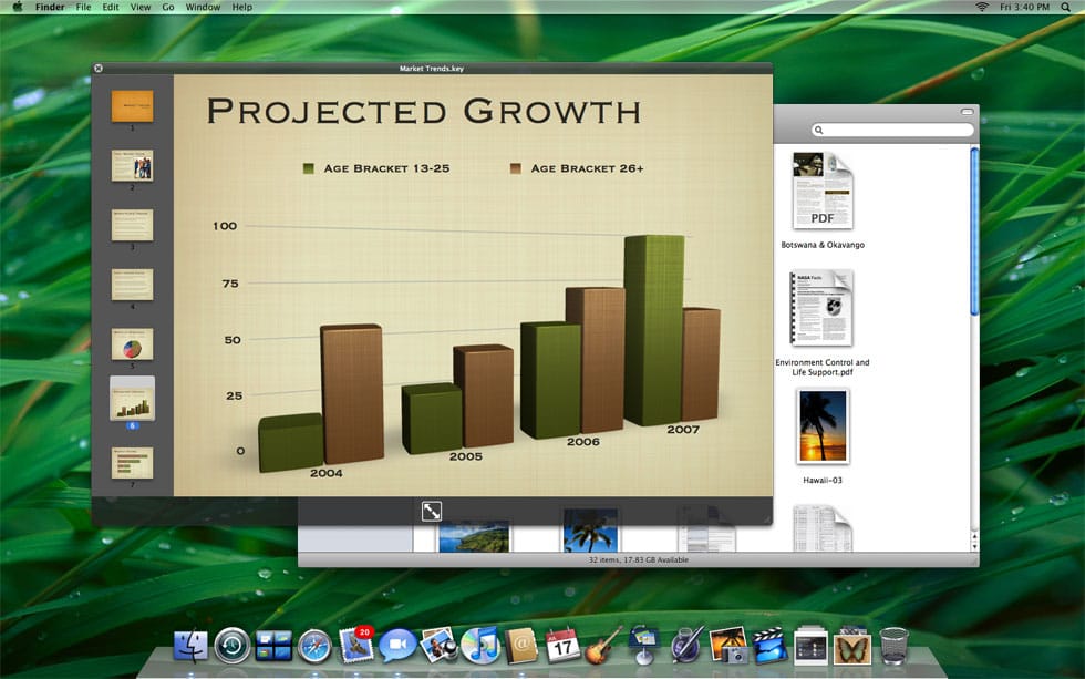
I assume that most people interested in Apple, operating systems or UI design have seen Steve Jobs’s WWDC07 Keynote by now. He shows off lots of new features of Leopard and I saw the death, or at least transformation, of the application.
Leopard has got all the usual bells and whistles of a new Mac OS. It’s easy to dismiss some of these things as simply cutesy, but sometimes minor tweaks make a massive difference (like YouTube’s awful decision to change that tiny ‘share’ button to ‘menu’).
The three features that interested me are tightly woven together - the new Finder, the new Desktop and, most importantly, Quick Look. The Desktop and Finder tweaks aren’t so important except that they integrate Quick Look, the ability to look into files without opening the host application. Some of this has already existed in terms of dragging objects between applications seamlessly, etc., but this a much bigger step.

For Mac application files this pretty much means being able to use the files directly in the Quick Look mode - you can browse for a movie and play it, then zoom it to full screen and watch it, without launching another application. The same appears true for PDFs and Keynote presentations, etc. But Apple have made Quick Look available for most popular file types (like Word and Excel files) as well as creating a plug-in architecture for any odd file types left out.
Death of the application
From a user-interface point of view this is the death of the application in the way that we currently conceive it. Finally, data of all types are just objects, not Photoshop files or Word documents, etc. Just ‘stuff’ that you can pick up and look at, maybe work with, and put down again. It’s a subtle but giant leap because it shifts the metaphor of thinking about the computer as a toolbox, to one of objects to be used. It’s quite a Web 2.0 concept (I hate that term too, but there it is). Objects are out there in the world, tagged (probably) and can be used or mashed together in all sorts of ways.
It’s a leap because it’s a much more natural way of existing in the world, much closer to lived experience. As a human I use and manipulate all sorts of objects and information in different ways, often all at once, without having to shift in and out of, say, a special room or suit. As I sit at the breakfast table, I don’t have to swap in and out of ’newspaper’ mode and into ’eating’ mode in order to butter my toast. They’re all just objects on the table, which is why the integration with the Finder and Desktop are important.
The concept behind Quick Look enables you to do many of the things you need to do without having to launch the application, so why have the application at all? Imagine, when you needed the application’s ’tools’ you just brought up the palettes and menu items. Think of the application’s engine as always there in the background, ready to be used. I’m having a look through some spreadsheets (to choose a really ’tool-based’ example) via something like Quick Look and I need to change a couple of cells. Perhaps I can just do it there and then, without launching the app. The file type is mapped to the application and the required code is accessed as needed.
Maybe if I need to do more complex work the application launches, but instead of it feeling like I’m moving to another environment, I just see the toolbars appear. You could gradually drift into a ‘deeper’ application mode if you needed, or you could stay shallow. It would be one of the ways around feature bloat in an application. If I need a screwdriver, I just take it out of the toolbox, I don’t empty out the entire toolbox onto the table.
Most importantly, this is the ideal way of thinking for mobile devices. Applications and folders are a nightmare to navigate on mobiles and most applications are slow to launch. I’ve yet to see a decent example, although maybe the iPhone will deliver. What it does show, though, is decades of misguided thought about computers and applications - all that HCI focus on tool-based functionality. Sometimes it’s about the tool, but the objects (the data) that you are working with are the focus of your attention and intention - the content should be the interface, which is why, I think, that all those multitouch interfaces are increasingly popular. Applications make much less sense in those environments.
 Andy Polaine