The most common issue my students face is project paralysis in the face of infinite possibilities and the synthesis of a mass of research material. Services are often complex, and the interconnectedness of problems can soon appear too difficult to tackle. Taking the leap to tentatively develop an idea, and letting go of the need for it to be the best idea possible is often a real challenge, especially when the concept remains an abstract and complex. I originally wrote as a mail to my students to help them think about how to get from “here to there” — from a hunch to research to concept. I thought others might find it useful in teaching, learning or practice too.
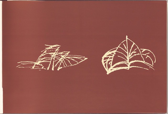
Product designers or architects conduct materials and form research alongside the user/customer research (some of them don’t do any of the latter, unfortunately). Of course, they also create rough sketches throughout the process as part of their process. Architects, for example, often start with something very rough to get the initial shape or form. Have a look at Jorn Udzon’s sketches of the Sydney Opera House:

Jorn Udzon’s early “palm fronds” sketches that led to the design of the Sydney Opera House. Image: State Records NSW
The sketches started as a sketch of palm leaves, thinking about the form from quite a philosophical, impressionistic angle.
At some point someone needs to detail the door hinges and where the power outlets go. But not at this stage. At this stage the form and maybe some of the materials and surfaces are important along with the overal functions — the main theatre, foyer, restaurant, etc. But these also change during the design process. The restaurant might be relocated to the other side, another theatre might be added or removed.

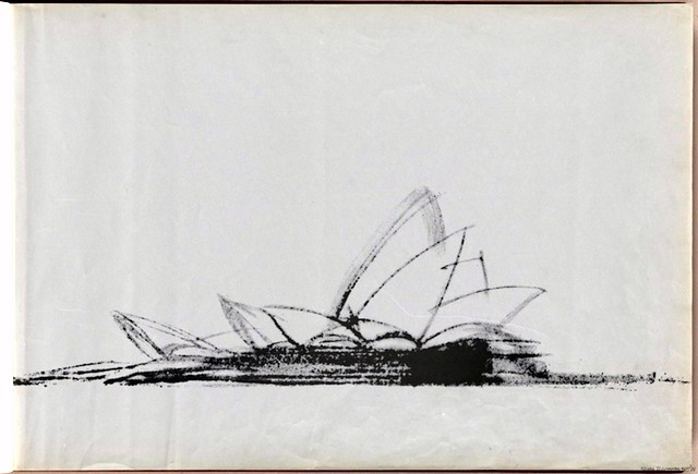
Jorn Udzon’s more resolved sketch of the Sydney Opera House design. Image: State Records NSW
Service designers face a problem with this. In some way, they need to go through a similar sketching process, but sketching out all the touchpoints runs the risk of getting down to the detail level too soon. How do you sketch and think through the overall “shape” of your service and gradually refine it? Each time you refine it, you will raise more questions that you will need to answer through new designs or more research.
The challenge is that you are designing something that you cannot really see. So make it tangible and visible. Sticky-note clusters, blueprints, journey maps, storyboards, etc. are all ways to do this.
The Hand Method
One way to approach this is with the “hand” model. I learned this approach from Mario Giudici and Daniel Hunziker, who I believe originated it, evolving it from SRI’s NABC method:

You need to work out the following:
1. A thesis or statement
For example, based on three of my students’ project topics:
- Family tourists in cities are not adequately served
- HSLU has poor accessibility for the disabled
- Shoe factory workers in Columbia have poor working conditions and customers don’t know about it
2. Questions
The first question is usually: What do you know in order to be able make the above statement?
Others might be:
- Who are the stakeholders (workers, students, families, customers, employees, factory owners, tourism offices, etc.)
- What are the statistics and facts?
- What exists already?
- Why didn’t previous solutions work?
- What gets in the way of change?
- What is the broader context (macro view)?
- What is the experience like for individuals (micro view)?
Now you can see how this directs your research. Some questions lead to desk and quantiative research, others lead to qualitative field research.
3. Facts
So, you’ve done some research, now tell me some facts. These are often quantitative (but not always). For example (I’m making up this data for the examples, obviously):
- Vienna only has four playgrounds.
- There are 127 disabled people studying or working at HSLU.
- Columbian shoe factory workers work 10-hour shifts for $10 a day.
4. Stories
This is the qualitative evidence that makes it human and personal. For example (again, invented for these examples):
- Peter and Simone want to visit the museums in Wien but feel bad that dragging around their five year-old son, Julius, because he gets bored and wants to play at the playground. They have to spend ages on Google Streetview planning their day out.
- Karin is in a wheelchair and has to call the Hausmeister (janitor) or ask a passer-by for help every time she wants to get into her college building, because the laneway is so steep. It is humiliating and she feels like she is a burden, plus she is always late to class, which is embarrassing.
- Pedro has aching shoulders every evening because his workspace is so small. He regularly injures himself because it is so cramped too. This means he is off work and his family have no money to buy food unless they borrow it at unfairly high interest rates.
By this point, you should be starting to get a pretty good picture of what you might create to help. You’ve gone from the background/big picture down to the human level. This is the essence of human-centred and service design.
5. Idea(s)
Now that you have all that background, you should find some ideas present themselves pretty quickly. For example:
The travel project
- A travel guide app/website/printed thing that shows where all the cool things for kids are next to the key tourist attractions in Vienna. It suggests timed tours that break up the day so that children won’t get bored.
- An app/game for kids called “how to lose your parents in Vienna and still stay safe.”
- A guide about how to turn the Vienna Museum of Young Art into a game.
The accessibility project
- An RFID system that automatically opens doors and alerts help staff for people with disabilities.
- A matching service for disabled students and volunteer helpers.
- An inclusive design manual for the design of all HSLU services and facilities.
The shoe project
- A shoe factory working environment co-designed with workers that is healthier and more engaging to work in, resulting in increased efficiency and staff happiness in the factory and more loyalty to the factory.
- A shoe brand that communicates the stories behind the ethical manufacture of their shoes, pitching them above their cheap-labour competition.
- An online, crowd-funded shoe store that allows individual craftsmen to make and sell their shoes through micro financing (like a kiva.org for shoes).
None of the above is brilliantly original right now — I just came up with them off the top of my head, but you should be able to see three things here:
The first is that your idea is based on knowledge. You can verify your assumptions.
The second is that this is an iterative process. Much like moving from rough sketch on a napkin to 3D rendering to detailed plans, you are moving through cycles of resolution and granularity. New facts and stories may raise new questions, which may trigger more research and lead to you changing your hypothesis/statement (maybe kids or disabled people are well serviced, maybe workers don’t want things to change, maybe the problem is elsewhere).
This, in turn, will lead you to refine or expand your research to answer those questions and you may change your idea (“pivoting” in start-up jargon). For example:
- Not a city guide for parents, but a game for kids to connect with other kids in a new city.
- Not helpers for disabled people to get into a space, but a space where people come to them.
- Not an online shoe store, but an in-store factory.
The third lesson is that this sequence — statement, questions, facts, stories, ideas — is the one you use when you present or pitch. You grab our attention with a problem statement, at which point we mentally question how you know this. You highlight those questions, then you show us the facts and make them human with the stories. At this point, your audience or jury is thinking that someone really should do something about it and help these people. And there is your idea, ready to do just that.
One final rule
Make your idea tangible as quickly as possible.
Even in the middle of the concept generation process, you haven’t made any of these services yet, so your investment is minimal. You can view your core idea and the results of your research from different angles and come up with many different ideas. Each time, think through what the experience might be, what kinds of resources, services or business model might work with this? How would someone abuse the service or game the system? Is this something people actually want and need? If you don’t know the answer to these questions, go and find out. That’s what research and prototyping is for.
Going through this initial iterative process takes a days, not weeks or months. If you are taking longer to iterate, you are overthinking it at this stage. You are thinking about the colour of the bathroom tiles when you don’t yet know the shape of the Sydney Opera House or how many bathrooms it even has.
It takes about five minutes to sketch out a 4–5 frame stickman storyboard of any of these ideas. Think about what a service might look like. What is the experience? How is that experience communicated? What do people see, touch and interact with? With whom? Sketch it. Poor sketches are fine. A bad sketch is better than no sketch at this stage. Look at Udzon’s winning sketch of the Sydney Opera House. It’s not going to win any fine art prizes, but the building it turned into is legendary.
As soon as you have a sketch, you can work with someone else and talk them through your idea, discuss and refine it. It also means it’s not stuck in your head as a complicated, abstract idea you can procrastinate over for weeks. It’s just a sketch of a scenario that you can improve and work on. A simple sketch of a touchpoint often reveals all the problems and other things you need to think about. These issues rarely surface unless you can see a tangible artefact in front of you. Our brains have a habit of wallpapering over the cracks. Your job as service designers is to reveal the cracks and design for them to disappear.
This piece was originally published on Medium titled Getting From Here to There.
 Andy Polaine