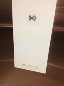
I think I could write a whole series on lift buttons - I regularly see people struggle with this most rudimentary of interfaces. These buttons are from a smart new building at the Hochschule Luzern. They’re touch sensitive buttons displayed by an LED lighting up behind stencilled glass.
It looks trendy, but in practice, they’re awful. There is no satisfying affordance of pressing a physical button (and people love hammering lift buttons even though they know it doesn’t make the lift arrive faster). If the LEDs blow, you don’t know where the buttons are or even if they still work.
If the power completely goes, you won’t even see any of the emergency call buttons printed on top of the glass.
If you are blind, you are totally out of luck anyway. But despite this building having a toilet for the disabled on the ground floor, this lift appears to be only accessible after a flight of five steps, so obviously disability was pretty much and afterthought anyway. Shameful.
 Andy Polaine