15 fantastic data visualisations is a collection of “some of the best and most beautiful visualisations on the web that are based on time, geography, sound data and more” on .net magazine’s website.
The 15 are selected by Brian Suda, software developer, informatician and author of A Practical Guide to Designing with Data, a Five Simple Steps book.
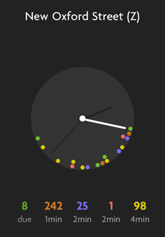
Bus O’Clock from Sennep is cute. Just need one for Germany/Switzlerand now, please.
 Andy Polaine