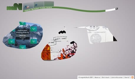
Great to see magneticNorth’s new website live. Brendan gave me a sneak peek of it yesterday and I love it.
The navigation is very playful and intuitive. Actually it is intuitive because it is playful. You basically scribble a doodle and this makes a mask into which a piece from their portfolio opens. You can then click on that item to view more info about the work or simply make another scribble to look at a new piece. The navigation across the top is a history that you can move back and forth through or reset.
What is nice about the whole thing is that you just don’t have worry about doing anything ‘right’. You can scribble any shape and you can scribble over the top of other scribbles and everything automagically sorts itself out.
Go and have a play yourself and tell me what you think.
[UPDATE: Quite some debate started about this, which I’m very happy to be part of. I wrote a long response, which is almost a post in itself, but decided to leave it in the comments.]
 Andy Polaine