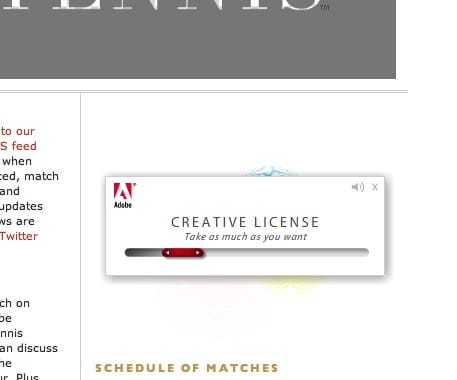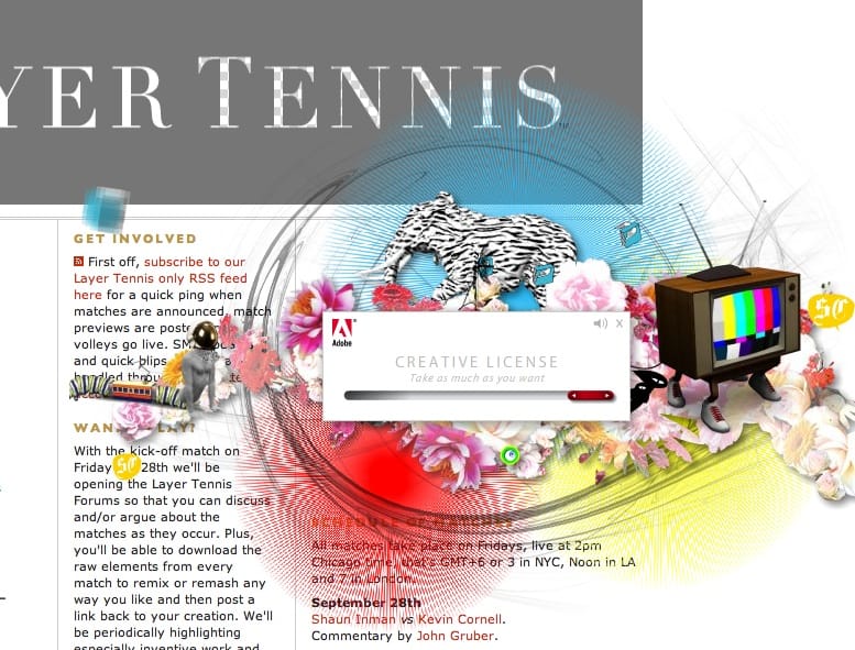
I interacted with a banner ad today, and actually enjoyed it. Adobe’s Creative License campaign is currently on display at Coudal Partners’ Layer Tennis page and is a clever bit of unobtrusive and playful banner advertising - I’m shocked to even write that sentence.

It’s a good integration of the message and a decent pun, but it’s also a sweetly made tiny little interactive experience. Basically the slider reveals more or less ‘crazy creative stuff’ with a little audio. I must have slid the slider back and forh, oh, at least four or five times and I even clicked on it to go an visit the predictably over-glossy microsite, which I soon bored of.
If that sounds like it isn’t much of a triumph, have a think about the last banner that engaged you. I can’t think of any. It’s nice to see people thinking a bit more creatively (appropriately for the brand) about these things.
The campaign was developed by Oops, CS3 conference conference development by Trekk Cross-Media, but the banner was by Goodby, Silverstein & Partners.
 Andy Polaine